
Sure, you’ll hire a graphic designer for your future best seller, but you are in control of your book cover – front, back and spine. Let’s look at the anatomy of a book cover, and how to make it shine.
You can’t judge a book by its cover. And yet, most people do, most of the time. If you want your book to sell more copies, it had better have a well-thought-out, carefully designed cover. Let’s look at how to design the perfect best seller book cover, one part at a time.
Front cover design
The most important element on the cover is the front cover image. That is what people will see first. That is what will catch people’s eyes. Make sure the image looks good life-sized, but also that it shows up clearly in miniature when people shop online. That calls for a fairly simple picture.
The second most important item on the cover is the title. Once again, consider the cover in miniature on a mobile phone. Make it short. Make it large. Make it contrast well with the image behind it.
Even if you are a debut author, people want to know your name. Make sure the author name is big enough that it can be read in miniature, if at all possible.
Color counts. If there is a row of books all in similar colors, and yours is a bright or contrasting color, people are more likely to notice your book. On the other hand, there might be a reason why many books in your genre all have similar colors, so there is a lot of thought that needs to go into color.
Speaking of your genre, take some time to review the covers on recent bestseller lists, as David Gaughran does. These are the colors and the designs that people are used to seeing, and they most likely played some role in the sales success of the books. Learn from the success of others when designing your cover.
 And learn from the failure of others. There is a great Pinterest board called “Funny As Shit Book Covers“. Some of the images are funny because the titles or ideas of the books are bizarre, some are spoofs (actually, quite a lot of them), but others are funny just because the covers are downright embarrassing.
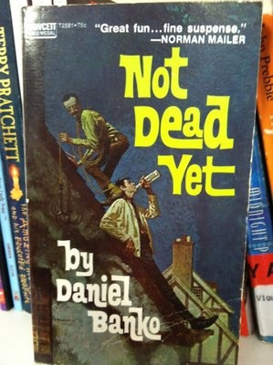
For instance, the cover of Not Dead Yet would never work in today’s online marketplace. The font is too complex and the image is too complex. People’s eyes will just gloss over it and land on the next cover that is easier to view in miniature. Plus, I’m not even sure what the picture is depicting.
Bottom line, you want your book to stand out so that people notice it…but you want your book to fit in so that people understand it at a subconscious level. It is a tall order, but if you find that sweet spot that combines standing out and fitting in, you will profit from it.
Spine design
As important as the front cover is to online sales and to people who pick up your book in the store, the spine is what most people will see in bookstores before they pick up your book.
Even if you run with dull colors on your front cover, you might want to choose a bright color for the spine. Pop into a couple local bookstores and see what colors are already in use where your book would be stacked, then pick a color for the spine that will stand out amid those already there.
Back cover design
This is where things get complicated. The anatomy of a book cover includes all parts.
The front cover and/or the spine are there to grab your attention. The front cover is also there to arouse curiosity. The next thing you are likely to do is flip the book over and read the back cover.
The back cover will either sell you, or make you flip open the book and peruse a few pages, usually without reading (which is really just a mental stalling block while you are deciding whether to let the cover sell you).
On the back cover, you will see a blurb. The blurb is often referred to as a summary of the book, but it should not be a summary. However, it is crucial to making the sale. The blurb is what most people will rely on to tell them that what’s inside the book is worth their time to read. This is not the place to summarize what happens in the book. This is the place to let people know what it is about, arouse curiosity, build anticipation and leave them dying to find out what’s inside. You book won’t be a best seller unless people actually buy it.
The author photo is important, too, because people want to connect with the author. For fiction, make sure you look approachable; a clean, casual look might be best. For non-fiction, a suit or lab coat is best, because readers are looking for someone with authority.
The author bio is as important as the author photo, as this short paragraph will say to people’s minds what the photo said to their hearts. Make sure the photo and the bio convey the same basic information, or neither one will work.
Testimonials can seal the deal. If you can post a tribute such as “One of the monuments of modern science fiction” from the Chicago Tribune (I took that one from the back over of Dune), you have it made. If not, try to get a testimonial from a well-known authority in your niche. The same back cover of Dune also features a quote from Arthur C. Clarke: “I know nothing comparable to it except Lord of the Rings.” You might attract a lesser known expert in your niche, but if he or she has an impressive title, that’s good, too.
If you plan to sell your book in stores, which more often than not is the case, you will need space for a bar code with ISBN (the book’s official number), as well as the price.
Do it yourself design or outsource to a graphic designer?
 This is the big question for most indie authors, although less of a concern for those going through a publishing house. Doing it yourself is a lot of work. As a writer, the text should be easy for you. But the design can get very time-consuming and it is unlikely to look convincingly professional. If something just doesn’t feel right, people will pass your book over for one that does feel right.
Plus you’ll have to make sure to conform to your printer’s specifications for cover dimensions, including the width of the spine, bleed allowance, etc.
Your best bet is to hire a professional designer, and provide any elements you can. The text and the author photo are obvious. Here is what we ask people to provide when we design a book cover:
- The title and subtitle of the book.
- The author’s name as you want it to appear.
- Any photo you want on the front cover.
- Any photo you want on the back cover.
- All text for the back cover (blurb, testimonial, etc.). If one of our ghostwriters wrote your book, please ask him/her to write the blurb for you. We are always happy to throw that in for free.
- The exact cover specifications your printer provided.
- Your ISBN (book number), which we will convert into a bar code (only necessary if you plan to sell your book in stores).
By the way, a professionally designed book cover should not cost you too much. Unless you really need original artwork to be drawn, we do quality book cover designs for $250.

The book’s cover is more than just a wrapper. It is your main sales tool. If people notice your cover and connect with it, they will buy your book. If they don’t notice your cover or don’t connect with it, the author of the book next to yours will be very grateful.
VIDEO VERSION: Anatomy of the perfect book cover design to sell more books
- This video was made using InVideo.io
 About David Leonhardt