Now that you’ve written your promotional materials, how do you get them designed and printed? This is the challenge small businesses and authors share in common. Here is a free solution.
Not long ago, I wrote about the power of bookmarks to help market your book, and how the same principle can be applied to almost any small business. Now Brother has created a ton of free templates to make it easy-peasy to create flyers, posters, calendars, business cards and other standard promotional materials.
Let me show you how.
But first, fair disclosure: I am biased in that my printer is a Brother and I have been pleased as punch with it for at least three years now.
If you live in the United States, I urge you to design your own promotional materials by March 19 so that you can enter the Brother CreativeCenter “Back to Business” Contest hosted at BizSugar, because the prize pack is pretty spiffy.

My Brother CreativeCenter Review
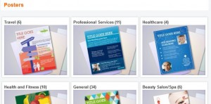
I set out to create a flyer, something easy to hand out at meetings or trade show booths. So I chose a poster template, and selected a “new product” style, just because I thought the layout would work well for me. You can see a thumbnail of what it looks like in the image above. There are several niche-specific pre-formatted poster designs, such as hospitality, real estate, healthcare, etc. to make it even easier.
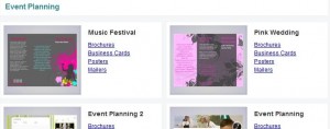
There are also suites of themed designs, so that you can easily create all your promotional items to work well together. For example, there are several suites specific to event planning…
These are templates, meaning shortcuts that don’t have to be touched, except to add your own text. That’s the easy-peasy part for people who don’t want to play with the design or customize anything.
Each design element can be removed or edited, and all colors can be changed or tweaked for brightness, hue and saturation. That’s for those of us who can’t resist the opportunity to customize our messages. There is a good tutorial on YouTube to help out with this.
I played around with adding extra photos and changing shapes and sizes of all the boxes. Then my computer screen froze – and I had foolishly not saved my work.
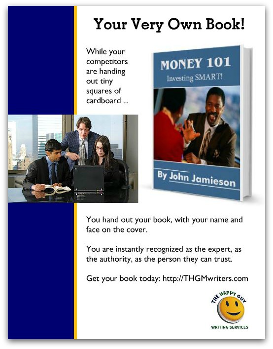
So I started over, changing color, adding my text and replacing the photos with my own images. The only things I added were the thin ochre line and a heading. It took me about 15 minutes to create the poster. And…Voila! Here is my masterpiece:
Of course, the printed version is in high resolution PDF; this is just an image clip I snapped.
I could have gotten a lot fancier, adding a lot of extra design elements. But I don’t think adding anything else would have made this poster any better. In fact, I think adding anything else would have detracted from it.
To get an idea of the possibilities, here are some examples of contest entries, to show you what others have done (and to give you an idea, just by looking, of what works and what doesn’t). So, if I was eligible to enter the contest, do you think I would win?
Confession time.
I have an ulterior motive for creating this poster. You see, I would like you to use it to earn an easy $1000, because that is what I am paying for referrals. You can read all the details here.


Excellent content, David. I absolutely love Biz Sugar.
To Your Success,
Stacie