
It’s not just what you write in your blog that counts. It’s also what your blog looks like as people scan the page.
NOTE: This is Part 5 of the “mouth-watering blog posts” series. You have come up with a superb idea and a headline to match. Your writing is superb and you’ve added some attractive images. There’s one last piece of business to attend to.
Have you ever noticed how effective a plate of food is on a menu? Studies show that people tend to order the items pictured much more than those that are included just as text.
In fact, they tend to order things that look appealing. Never mind that looks have no bearing on taste; looks have every bearing on whether people expect the dish to taste good.
It’s the same way with a blog post. People tend to read the posts that are visually appealing, with all the ingredients organized just right. Never mind that looks have no bearing on accuracy, usefulness or relevance; looks have every bearing on whether people expect the post to be worth their time to read.
Let’s see how to make your blog posts look amazing.
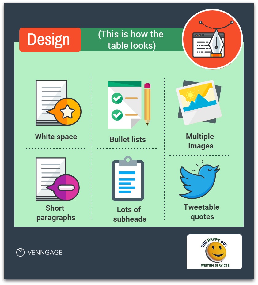
Create white space in your blog
White space is very important. People prefer to drive when they can afford to, because they don’t like crowded buses. They don’t like crowded elevators. They are protective of their personal space.
On your blog, give your readers their personal space.
There are two aspects to this. The first is a one-time fix. It’s how your blog is laid out. Are the headers and margins over-crowded? Is there space between the site-wide elements and the individual posts.
It’s worth your time to hire a designer to add white space to your overall theme.
Consider also how your text looks. Does the font look crowded? Is there white space between paragraphs and between words? Much of this can be set in the CSS file, and it will affect the entire site.
Use short paragraphs
The other aspect is how you create each blog post.
What you want to avoid are long paragraphs. They form large blocks of text that make the page feel heavy and crowded. They make it look like this will be a lot of work to read. Only the truly committed will risk that burden. You’ll lose most other readers.
You might as well post a “Keep out!” sign.
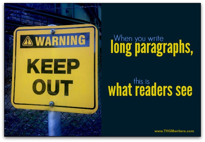
Break up long paragraphs into smaller paragraphs. And vary the length as much as possible.
Add bullet lists to your blog
Use bullet lists whenever they will work.
- Bite-sized information is so much easier to read.
- Plus, it looks organized (and, therefore, less work to digest).
- And bullet lists are nests for white space, making the page less intimidating to read.
More importantly, bullet lists replace long, unwieldy sentences that not only look hard to read, but actually are hard to read.
Fan fact: unless you need the list to be in a certain order, list the items from shortest to longest, forming a visual pyramid on the page. Research shows that readers find this special structuring easier to follow, and they are more likely to read the list (and the page).
Why? Perhaps it’s just because the list looks more organized, so the brain can focus on the words and their meaning, rather than trying to make sense of a hodge podge.
Use lots of subheads
Subheads break up the text, creating extra white space. But they serve a couple other purposes.
Like bullet lists, subheads structure your information. More importantly, they show your reader that the information is structured. In other words, this won’t be a mess to read – the “cost” of reading is lower.
When your information looks organized, it looks more professional and more credible. In other words, there is more value to reading it.
Less cost. More value. No wonder bullet lists and subheads make sense.
Subheads also allow people to find what they are looking for more easily. Rather than losing people who don’t care about most of your information, you send them directly to what they are looking for.
Subheads also give the appearance of several smaller articles. Give people bite-sized food, and they will eat more than if you give it all to them on one plate.
And subheads also have the benefit of pulling in scanners. A “reader” might have left the text, started scanning to see if there is anything else worth reading, then get pulled back into your post by a subhead further down. You can recapture lost readers with good and frequent subheads.
Include multiple images
The more visual content, the more enticing a blog post is. Remember the menu? The more images, the more people are drooling to order.
Multiple images makes the blog post look more vibrant, more alive…and therefore less boring to read.
What else do images do? You guessed it, they break up the text. So the more, the merrier.
Images that convey information are best. They serve the added purpose of pulling in scanners, acting as subheads.
Images that convey information are like mini, visual articles. Even if someone has decided they don’t want to read through a lot of text, the images are easy to read. At least you’ve gotten some information through.
And if that information piques their interest, they might end up reading some of what you’ve written.
Add Pre-fab tweets for Twitter sharing
You’ve seen them before, right? Here’s an example. Try it out for yourself:
The obvious purpose for including pre-fab tweets is that they help readers more easily share your blog post. That’s why they are there.
But they serve another purpose. They break up the text and add white space. As with most of the other visual elements we’ve looked at, they give the reader that crucial room to breathe.
How to make your blog post look mouth-watering
What we’ve learned here is that the look of your blog post can convert traffic into readers. Or it can drive them away, just as easily.
What you want to avoid is large, crowded blocks of text. What you want to strive for is:
- lots of white space – room for readers to breathe
- structure, so that your information looks organized and therefore easy to read and to understand
- color and variety, so that it looks interesting and pleasant to read
- subheadings and images that help your reader see options for getting your information
These tips will help you attract readers, retain readers and recapture escaping readers. Optimize your blog visually, to drive the highest readership possible.
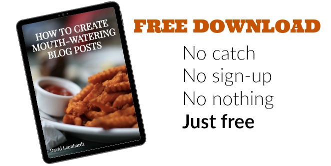
Want to learn more?
Read the free ebook How to create mouth-watering blog posts, based on this Infographc.
 About David Leonhardt
at 12:52 am
How do you create those pre-fab tweets? (this is for those of us who don’t get Gutenberg and rely on the old editor to create our posts!)
at 1:19 am
Hi Roy. I use a plugin: https://wordpress.org/plugins/click-to-tweet-by-todaymade/
It’s pretty simple to use.
at 1:51 am
Thank you SO much for that help!
at 10:43 am
Thanks for sharing. I agree with your ideas. I saw an article that was too long to move the scroll bar. But it had a lot of images and short instructions, which helped me get the topic easily.
at 8:04 pm
HI David, great tips. I love seeing white space so I can easily scan a blog post. Who has time to read a ton of text today right? Images help too and having multiple ones help with sharing on social networks. I like to mix them up. Thanks for your tips David.
at 1:04 am
Excellent advice. There’s nothing worse than trying to read a wall of text with no breaks or headings. 🙂 Thank you for the post.